节点用户界面元素
n8n 提供了一组预定义的 UI 组件(基于 JSON 文件),允许用户输入各种数据类型。以下是 n8n 中可用的 UI 元素。
字符串
基础配置:
 1
 2
 3
 4
 5
 6
 7
 8
 9
10
11
12
13
14
15
16
17
18
{
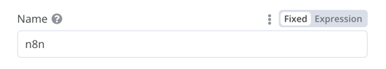
displayName : Name , // 用户在界面中看到的值
name : name , // 代码中引用该 UI 元素的名称
type : string ,
required : true , // 字段是否为必填项
default : 'n8n' ,
description : '用户姓名' ,
displayOptions : { // 显示该元素的资源和操作
show : {
resource : [
// 逗号分隔的资源名称列表
],
operation : [
// 逗号分隔的操作名称列表
]
}
},
}
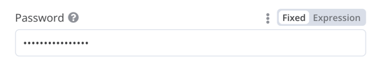
用于输入密码的字符串字段:
 1
 2
 3
 4
 5
 6
 7
 8
 9
10
11
12
13
14
15
16
17
18
19
20
21
{
displayName : '密码' ,
name : 'password' ,
type : 'string' ,
required : true ,
typeOptions : {
password : true ,
},
default : '' ,
description : `用户密码` ,
displayOptions : { // 显示该元素的资源和操作
show : {
resource : [
// 逗号分隔的资源名称列表
],
operation : [
// 逗号分隔的操作名称列表
]
}
},
}
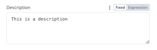
多行字符串字段:
 1
 2
 3
 4
 5
 6
 7
 8
 9
10
11
12
13
14
15
16
17
18
19
20
21
{
displayName : '描述' ,
name : 'description' ,
type : 'string' ,
required : true ,
typeOptions : {
rows : 4 ,
},
default : '' ,
description : '描述内容' ,
displayOptions : { // 显示该元素的资源和操作
show : {
resource : [
// 逗号分隔的资源名称列表
],
operation : [
// 逗号分隔的操作名称列表
]
}
},
}
支持数据键的拖放功能
用户可以通过拖放数据值来映射到字段。拖放操作会自动创建一个表达式 来加载数据值。n8n 会自动支持这一功能。
您需要添加额外的配置选项来支持数据键的拖放:
requiresDataPath: 'single':适用于需要单个字符串的字段requiresDataPath: 'multiple':适用于可接受逗号分隔字符串列表的字段
Compare Datasets 节点代码 中有相关示例。
数字类型
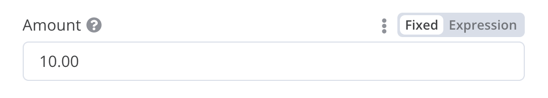
带小数点的数字字段:
 1
 2
 3
 4
 5
 6
 7
 8
 9
10
11
12
13
14
15
16
17
18
19
20
21
22
23
{
displayName : '金额' ,
name : 'amount' ,
type : 'number' ,
required : true ,
typeOptions : {
maxValue : 10 ,
minValue : 0 ,
numberPrecision : 2 ,
},
default : 10.00 ,
description : '您的当前金额' ,
displayOptions : { // 显示此元素的资源和操作
show : {
resource : [
// 逗号分隔的资源名称列表
],
operation : [
// 逗号分隔的操作名称列表
]
}
},
}
集合(Collection)
当需要显示可选字段时,使用 collection 类型。
 1
 2
 3
 4
 5
 6
 7
 8
 9
10
11
12
13
14
15
16
17
18
19
20
21
22
23
24
25
26
27
28
29
30
31
32
33
34
35
36
37
38
39
{
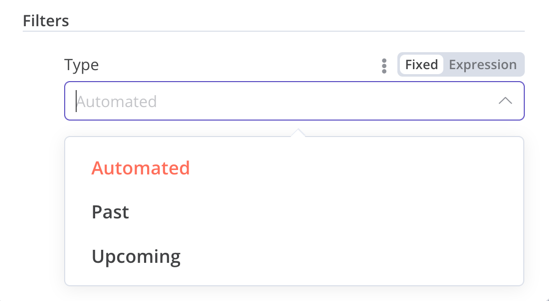
displayName : '筛选条件' ,
name : 'filters' ,
type : 'collection' ,
placeholder : '添加字段' ,
default : {},
options : [
{
displayName : '类型' ,
name : 'type' ,
type : 'options' ,
options : [
{
name : '自动' ,
value : 'automated' ,
},
{
name : '过去' ,
value : 'past' ,
},
{
name : '即将到来' ,
value : 'upcoming' ,
},
],
default : '' ,
},
],
displayOptions : { // 显示此元素对应的资源和操作
show : {
resource : [
// 逗号分隔的资源名称列表
],
operation : [
// 逗号分隔的操作名称列表
]
}
},
}
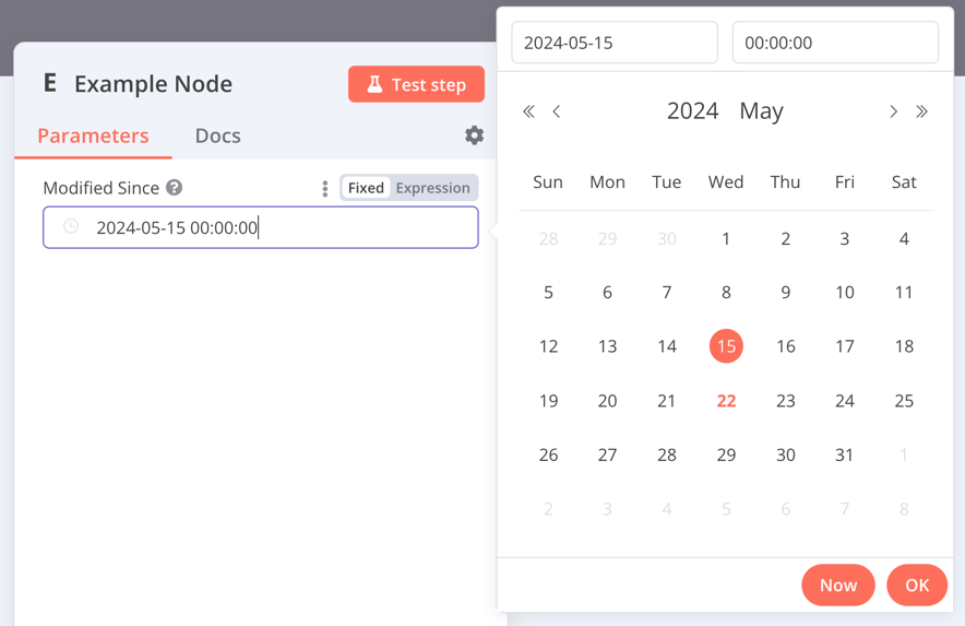
日期时间(DateTime)
dateTime 类型提供日期选择器。
 1
 2
 3
 4
 5
 6
 7
 8
 9
10
11
12
13
14
15
16
17
{
displayName : '最后修改时间' ,
name : 'modified_since' ,
type : 'dateTime' ,
default : '' ,
description : '文件最后修改的日期和时间' ,
displayOptions : { // 显示此元素对应的资源和操作
show : {
resource : [
// 逗号分隔的资源名称列表
],
operation : [
// 逗号分隔的操作名称列表
]
}
},
}
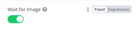
布尔值(Boolean)
boolean 类型添加一个用于输入真/假的切换开关。
 1
 2
 3
 4
 5
 6
 7
 8
 9
10
11
12
13
14
15
16
17
{
displayName : '等待图片' ,
name : 'waitForImage' ,
type : 'boolean' ,
default : true , // 切换开关的初始状态
description : '是否等待图片' ,
displayOptions : { // 显示此元素对应的资源和操作
show : {
resource : [
// 逗号分隔的资源名称列表
],
operation : [
// 逗号分隔的操作名称列表
]
}
},
}
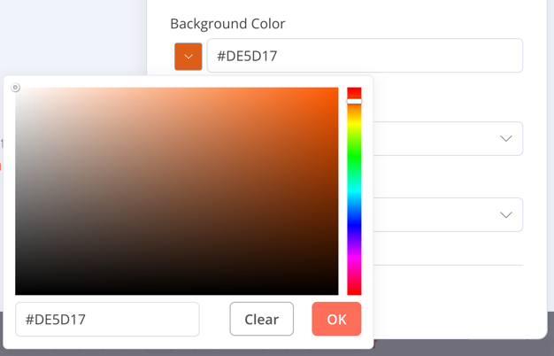
颜色选择器
color 类型提供一个颜色选择器组件。
 1
 2
 3
 4
 5
 6
 7
 8
 9
10
11
12
13
14
15
16
{
displayName : '背景颜色' ,
name : 'backgroundColor' ,
type : 'color' ,
default : '' , // 初始选中的颜色
displayOptions : { // 控制该元素显示的资源与操作
show : {
resource : [
// 逗号分隔的资源名称列表
],
operation : [
// 逗号分隔的操作名称列表
]
}
},
}
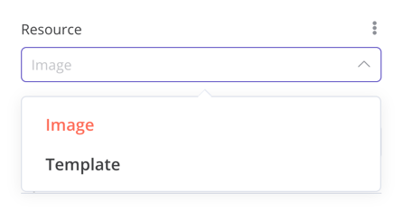
单选选项
options 类型添加一个单选列表。用户只能选择单个值。
 1
 2
 3
 4
 5
 6
 7
 8
 9
10
11
12
13
14
15
16
17
18
19
20
21
22
23
24
25
26
27
{
displayName : '资源类型' ,
name : 'resource' ,
type : 'options' ,
options : [
{
name : '图片' ,
value : 'image' ,
},
{
name : '模板' ,
value : 'template' ,
},
],
default : 'image' , // 初始选中的选项
description : '要使用的资源类型' ,
displayOptions : { // 控制该元素显示的资源与操作
show : {
resource : [
// 逗号分隔的资源名称列表
],
operation : [
// 逗号分隔的操作名称列表
]
}
},
}
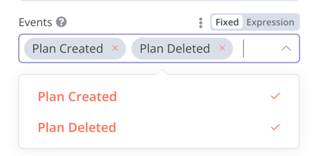
多选选项
multiOptions 类型添加一个多选列表。用户可以选择多个值。
 1
 2
 3
 4
 5
 6
 7
 8
 9
10
11
12
13
14
15
16
17
18
19
20
21
22
23
24
25
26
27
{
displayName : '监控事件' ,
name : 'events' ,
type : 'multiOptions' ,
options : [
{
name : '计划创建' ,
value : 'planCreated' ,
},
{
name : '计划删除' ,
value : 'planDeleted' ,
},
],
default : [], // 初始选中的选项
description : '需要监控的事件类型' ,
displayOptions : { // 控制该元素显示的资源与操作
show : {
resource : [
// 逗号分隔的资源名称列表
],
operation : [
// 逗号分隔的操作名称列表
]
}
},
}
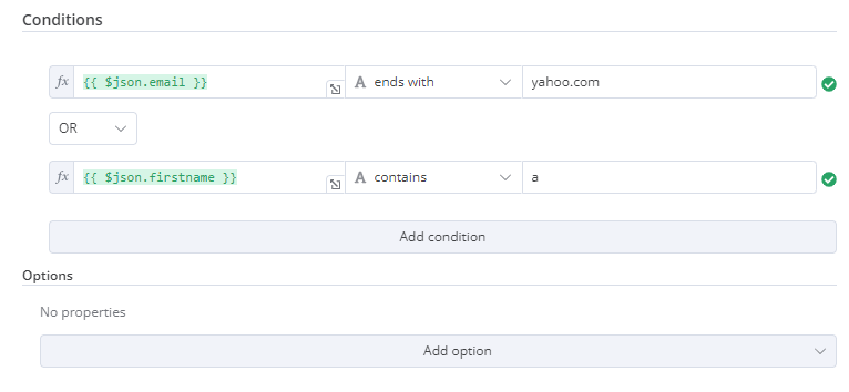
过滤器组件
使用此组件来评估、匹配或筛选传入数据。
以下是 n8n 内置 If 节点的代码示例,展示了过滤器组件与集合 组件的配合使用,用户可配置过滤行为:
 1
 2
 3
 4
 5
 6
 7
 8
 9
10
11
12
13
14
15
16
17
18
19
20
21
22
23
24
25
26
27
28
29
30
31
32
33
34
35
36
37
{
displayName : '条件' ,
name : 'conditions' ,
placeholder : '添加条件' ,
type : 'filter' ,
default : {},
typeOptions : {
filter : {
// 使用下方用户选项决定过滤行为
caseSensitive : '={{!$parameter.options.ignoreCase}}' ,
typeValidation : '={{$parameter.options.looseTypeValidation ? "loose" : "strict"}}' ,
},
},
},
{
displayName : '选项' ,
name : 'options' ,
type : 'collection' ,
placeholder : '添加选项' ,
default : {},
options : [
{
displayName : '忽略大小写' ,
description : '评估条件时是否忽略字母大小写' ,
name : 'ignoreCase' ,
type : 'boolean' ,
default : true ,
},
{
displayName : '宽松类型验证' ,
description : '是否根据所选运算符尝试转换值类型' ,
name : 'looseTypeValidation' ,
type : 'boolean' ,
default : true ,
},
],
},
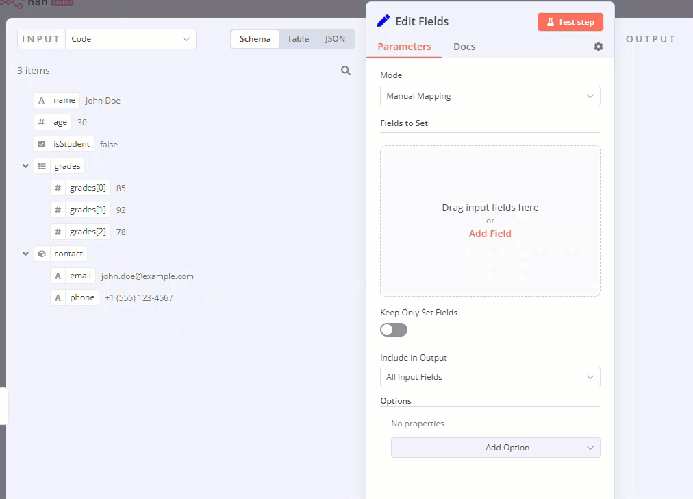
赋值集合(拖拽组件)
当需要用户通过单次拖拽交互预填名称和值参数时,使用此拖拽组件。
{
displayName : '待设置字段' ,
name : 'assignments' ,
type : 'assignmentCollection' ,
default : {},
},
可在 n8n 的编辑字段(Set)节点 中查看示例:
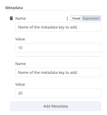
固定集合 (Fixed Collection)
使用 fixedCollection 类型来分组语义上相关的字段。
1
2
3
4
5
6
7
8
9
10
11
12
13
14
15
16
17
18
19
20
21
22
23
24
25
26
27
28
29
30
31
32
33
34
35
36
37
38
39
40
41
42 {
displayName : '元数据' ,
name : 'metadataUi' ,
placeholder : '添加元数据' ,
type : 'fixedCollection' ,
default : '' ,
typeOptions : {
multipleValues : true ,
},
description : '' ,
options : [
{
name : 'metadataValues' ,
displayName : '元数据' ,
values : [
{
displayName : '名称' ,
name : 'name' ,
type : 'string' ,
default : '要添加的元数据键名' ,
},
{
displayName : '值' ,
name : 'value' ,
type : 'string' ,
default : '' ,
description : '为元数据键设置的值' ,
},
],
},
],
displayOptions : { // 显示此元素的资源和操作
show : {
resource : [
// 逗号分隔的资源名称列表
],
operation : [
// 逗号分隔的操作名称列表
]
}
},
}
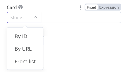
资源定位器
资源定位器元素帮助用户在外部服务中查找特定资源,例如 Trello 中的卡片或标签。
提供以下可选模式:
ID 模式
URL 模式
列表模式:允许用户从预填充列表中选择或搜索。此选项需要更多编码工作,因为您必须填充列表,并在支持搜索功能时处理搜索逻辑。
您可以选择包含哪些模式类型。
示例:
 1
 2
 3
 4
 5
 6
 7
 8
 9
10
11
12
13
14
15
16
17
18
19
20
21
22
23
24
25
26
27
28
29
30
31
32
33
34
35
36
37
38
39
40
41
42
43
44
45
46
47
48
49
50
51
52
53
54
55
56
57
58
59
60
61
62
63
64
65
66
67
68
69
70
71
72
73
74
75
76 {
displayName : '卡片' ,
name : 'cardID' ,
type : 'resourceLocator' ,
default : '' ,
description : '获取卡片' ,
modes : [
{
displayName : 'ID' ,
name : 'id' ,
type : 'string' ,
hint : '输入ID' ,
validation : [
{
type : 'regex' ,
properties : {
regex : '^[0-9]' ,
errorMessage : 'ID必须以数字开头' ,
},
},
],
placeholder : '12example' ,
// 如何在API调用中使用ID
url : '=http://api-base-url.com/?id={{$value}}' ,
},
{
displayName : 'URL' ,
name : 'url' ,
type : 'string' ,
hint : '输入URL' ,
validation : [
{
type : 'regex' ,
properties : {
regex : '^http' ,
errorMessage : '无效URL' ,
},
},
],
placeholder : 'https://example.com/card/12example/' ,
// 如何从URL中提取ID
extractValue : {
type : 'regex' ,
regex : 'example.com/card/([0-9]*.*)/' ,
},
},
{
displayName : '列表' ,
name : 'list' ,
type : 'list' ,
typeOptions : {
// 必须始终提供搜索方法
// 在基础文件的methods对象中编写此方法
// 该方法必须填充列表,并在searchable:true时处理搜索
searchListMethod : 'searchMethod' ,
// 如果希望用户能够搜索列表
searchable : true ,
// 设置为true将强制用户必须搜索
// 当为true时,用户无法浏览列表
// 设置为false则允许用户浏览列表
searchFilterRequired : true ,
},
},
],
displayOptions : {
// 指定显示此元素的资源和操作
show : {
resource : [
// 逗号分隔的资源名称列表
],
operation : [
// 逗号分隔的操作名称列表
],
},
},
},
实际案例参考:
资源映射器
如果您的节点执行插入、更新或合并操作,您需要以目标服务支持的格式发送数据。常见的做法是在发送数据的节点前使用 Set 节点来转换数据以匹配目标服务的架构。资源映射器 UI 组件提供了一种直接在节点内将数据转换为所需格式的方法,而无需使用 Set 节点。该组件还可以根据节点提供的架构验证输入数据,并将输入数据转换为预期类型。
映射与匹配
映射是指设置输入数据作为更新行时使用的值的过程。匹配是指使用列名来识别要更新的行的过程。
 1
 2
 3
 4
 5
 6
 7
 8
 9
10
11
12
13
14
15
16
17
18
19
20
21
22
23
24
25
26
27
28
29
30
31
32
{
displayName : 'Columns' ,
name : 'columns' , // 代码中引用UI元素的名称
type : 'resourceMapper' , // UI元素类型
default : {
// mappingMode可以在组件中定义(mappingMode: 'defineBelow')
// 或者可以尝试自动映射(mappingMode: 'autoMapInputData')
mappingMode : 'defineBelow' ,
// 重要:始终将默认值设置为null
value : null ,
},
required : true ,
// 完整typeOptions规范请参见下方的"资源映射器类型选项接口"
typeOptions : {
resourceMapper : {
resourceMapperMethod : 'getMappingColumns' ,
mode : 'update' ,
fieldWords : {
singular : 'column' ,
plural : 'columns' ,
},
addAllFields : true ,
multiKeyMatch : true ,
supportAutoMap : true ,
matchingFieldsLabels : {
title : '自定义匹配列标题' ,
description : '自定义匹配列的帮助文本' ,
hint : '自定义匹配列的字段下方提示' ,
},
},
},
},
参考 Postgres 节点(版本2) 查看使用数据库架构的实际示例。
参考 Google Sheets 节点(版本2) 查看使用无架构服务的实际示例。
资源映射器类型选项接口
typeOptions 部分必须实现以下接口:
 1
 2
 3
 4
 5
 6
 7
 8
 9
10
11
12
13
14
15
16
17
18
19
20
21
22
23
24
25
26
27
28
29
30
export interface ResourceMapperTypeOptions {
// 获取 schema 的方法名称
// 详情请参考资源映射器方法章节
resourceMapperMethod : string ;
// 为操作选择模式
// 支持的模式:add, update, upsert
mode : 'add' | 'update' | 'upsert' ;
// 为 UI 中的字段指定标签
fieldWords ?: { singular : string ; plural : string };
// 节点首次添加到工作流时,n8n 是否应为每个字段显示 UI 输入
// 默认为 true
addAllFields ?: boolean ;
// 指定当从服务获取不到字段时显示的消息
// (调用成功但响应为空的情况)
noFieldsError ?: string ;
// 是否支持多键列匹配
// multiKeyMatch 仅适用于 update 和 upsert 模式
// 默认为 false
// 如果为 true,节点会为匹配列选择器显示多选下拉框
multiKeyMatch ?: boolean ;
// 是否支持自动映射
// 如果为 false,n8n 会隐藏映射模式选择字段并将 mappingMode 设为 defineBelow
supportAutoMap ?: boolean ;
// 匹配列选择器的自定义标签
matchingFieldsLabels ?: {
title ?: string ;
description ?: string ;
hint ?: string ;
};
}
资源映射器方法
此方法包含用于获取数据模式的节点特定逻辑。每个节点必须实现自己的模式获取逻辑,并根据模式设置每个 UI 字段。
它必须返回一个实现 ResourceMapperFields 接口的值:
 1
 2
 3
 4
 5
 6
 7
 8
 9
10
11
12
13
14
15
16
17
18
19
20
21
22
23
24
interface ResourceMapperField {
// 服务中的字段 ID
id : string ;
// 字段显示名称
displayName : string ;
// 是否由 n8n 预选为匹配字段
// 匹配字段是用于识别要修改行的列
defaultMatch : boolean ;
// 该字段是否可用作匹配字段
canBeUsedToMatch ?: boolean ;
// 该字段是否为模式必填项
required : boolean ;
// 是否在 UI 中显示该字段
// 如果为 false,则不能用于匹配或映射
display : boolean ;
// 字段的数据类型
// 这些类型对应 UI 元素类型
// 支持的类型: string, number, dateTime, boolean, time, array, object, options
type ?: FieldType ;
// 如果用户从映射中移除了该字段,则在运行时添加
removed ?: boolean ;
// 为枚举类型指定选项
options ?: INodePropertyOptions [];
}
参考 Postgres 资源映射方法 和 Google Sheets 资源映射方法 查看实际示例。
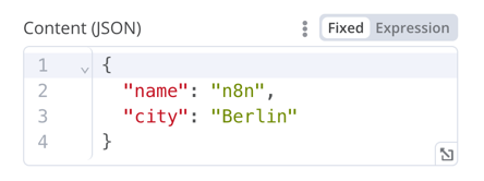
JSON
 1
 2
 3
 4
 5
 6
 7
 8
 9
10
11
12
13
14
15
16
17
{
displayName : '内容(JSON)' ,
name : 'content' ,
type : 'json' ,
default : '' ,
description : '' ,
displayOptions : { // 用于控制此元素与哪些资源和操作一起显示
show : {
resource : [
// 逗号分隔的资源名称列表
],
operation : [
// 逗号分隔的操作名称列表
]
}
},
}
HTML
HTML 编辑器允许用户在工作流中创建 HTML 模板。编辑器支持标准 HTML、<style> 标签中的 CSS 以及 {{}} 包裹的表达式。用户可以添加 <script> 标签来引入额外的 JavaScript。n8n 在执行工作流时不会运行这些 JavaScript。
{
displayName : 'HTML 模板' , // 用户在界面中看到的值
name : 'html' , // 在代码中引用该界面元素的名称
type : 'string' ,
typeOptions : {
editor : 'htmlEditor' ,
},
default : placeholder , // 加载 n8n 的占位 HTML 模板
noDataExpression : true , // 禁止对该字段使用表达式
description : '要渲染的 HTML 模板' ,
},
参考 Html.node.ts
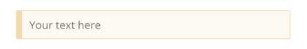
提示框
显示带有提示或额外信息的黄色框。关于如何编写良好的提示和信息文本,请参考节点界面设计 。
{
displayName : '你的文本内容' ,
name : 'notice' ,
type : 'notice' ,
default : '' ,
},
提示信息
有两种类型的提示信息:参数提示和节点提示:
参数提示是用户输入字段下方的小段文本。
节点提示比提示框 功能更强大灵活。可用于在输入面板、输出面板或节点详情视图中显示更长的提示信息。
添加参数提示
为 UI 元素添加 hint 参数:
{
displayName : 'URL' ,
name : 'url' ,
type : 'string' ,
hint : '输入 URL' ,
...
}
添加节点提示
在节点 description 的 hints 属性中定义节点提示:
 1
 2
 3
 4
 5
 6
 7
 8
 9
10
11
12
13
14
15
16
17
18
19 description : INodeTypeDescription = {
...
hints : [
{
// 提示信息。可以使用 HTML 格式
message : "此节点有多个输入项。建议在节点设置中启用<b>仅执行一次</b>选项。" ,
// 可选值: info, warning, danger。默认为 'info'
// 改变颜色。info (灰色), warning (黄色), danger (红色)
type : 'info' ,
// 可选值: inputPane, outputPane, ndv。默认 n8n 会在输入和输出面板都显示提示
location : 'outputPane' ,
// 可选值: always, beforeExecution, afterExecution。默认为 'always'
whenToDisplay : 'beforeExecution' ,
// 可选。表达式。如果解析为 true,则显示消息。默认为 true
displayCondition : '={{ $parameter["operation"] === "select" && $input.all().length > 1 }}'
}
]
...
}
为编程式节点添加动态提示
在编程式节点中,您可以创建一个包含节点执行信息的动态消息。由于这类提示依赖于节点输出数据,因此只能在执行后显示。
1
2
3
4
5
6
7
8
9
10
11
12
13 if ( operation === 'select' && items . length > 1 && ! node . executeOnce ) {
// 期望两个参数:NodeExecutionData 和提示数组
return new NodeExecutionOutput (
[ returnData ],
[
{
message : `此节点运行了 ${ items . length } 次,每个输入项运行一次。若仅对第一项运行,请在节点设置中启用<b>仅执行一次</b>。` ,
location : 'outputPane' ,
},
],
);
}
return [ returnData ];
要查看编程式节点中动态提示的实际示例,请参阅 Split Out 节点代码 。